On October 25, the artist book Iceland 2324 will be presented as part of the Bookshelf program at Artisbook Gallery.
After the exhibition, the book will become part of the gallery’s permanent archive.
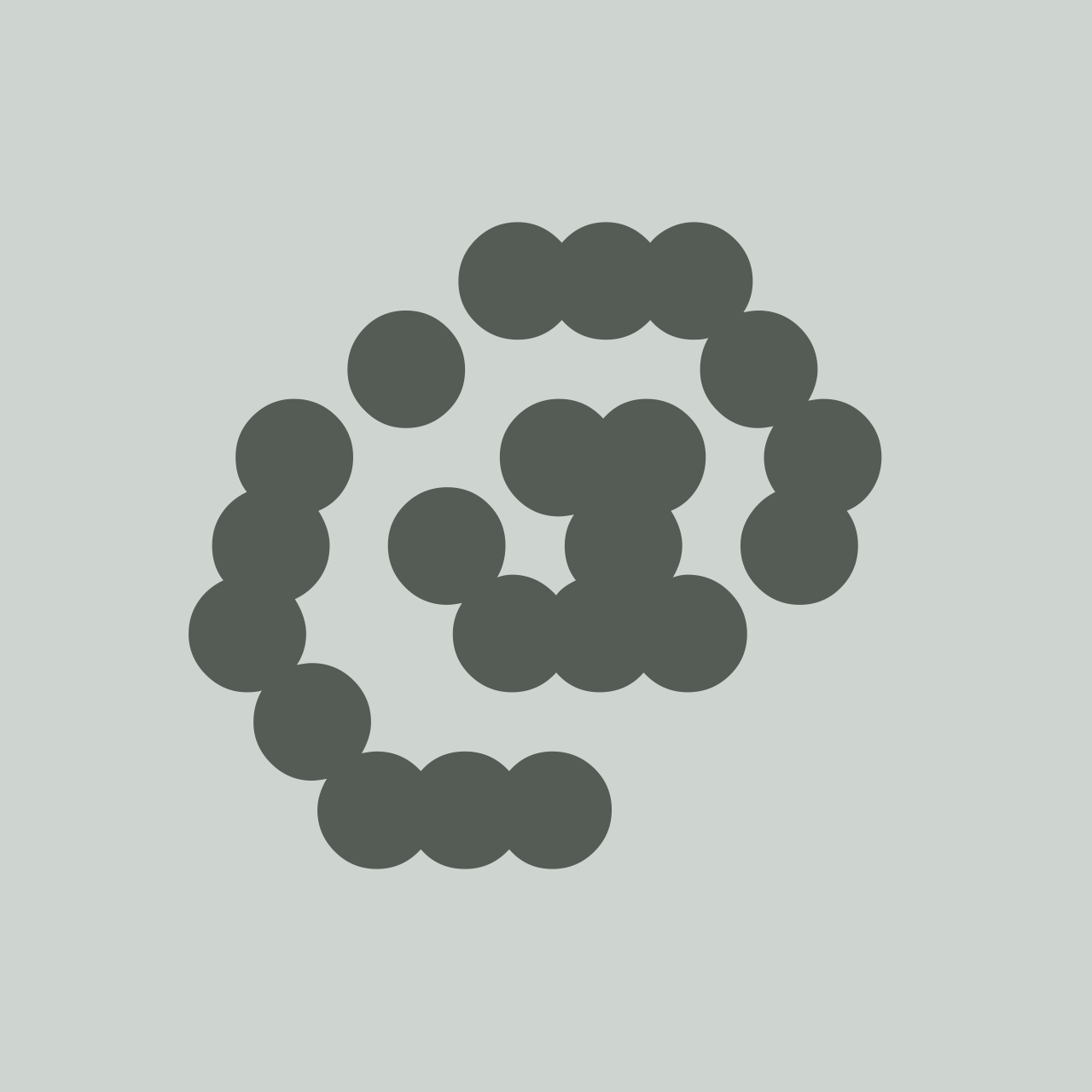
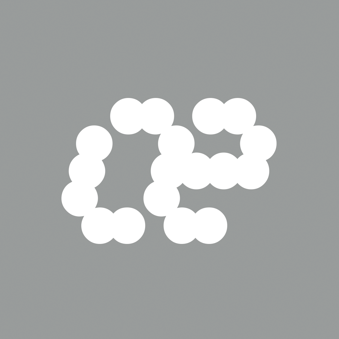
More Dots is an illegible font made up of seven circles. The total number of possibilities is 127 – the fourth Mersenne prime.
> BUY THIS FONT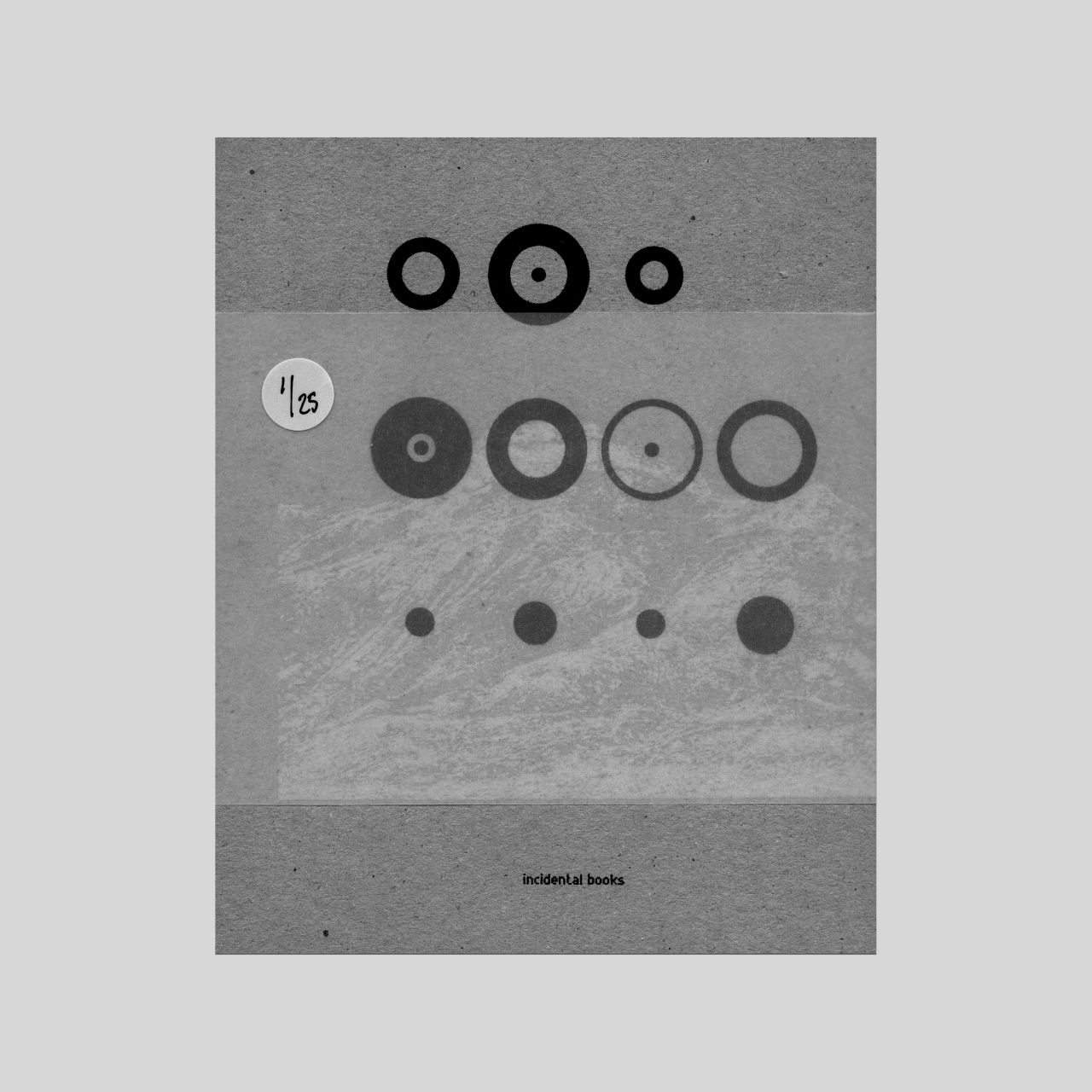
Artist book — collaboration DEBOER+GRASMAN
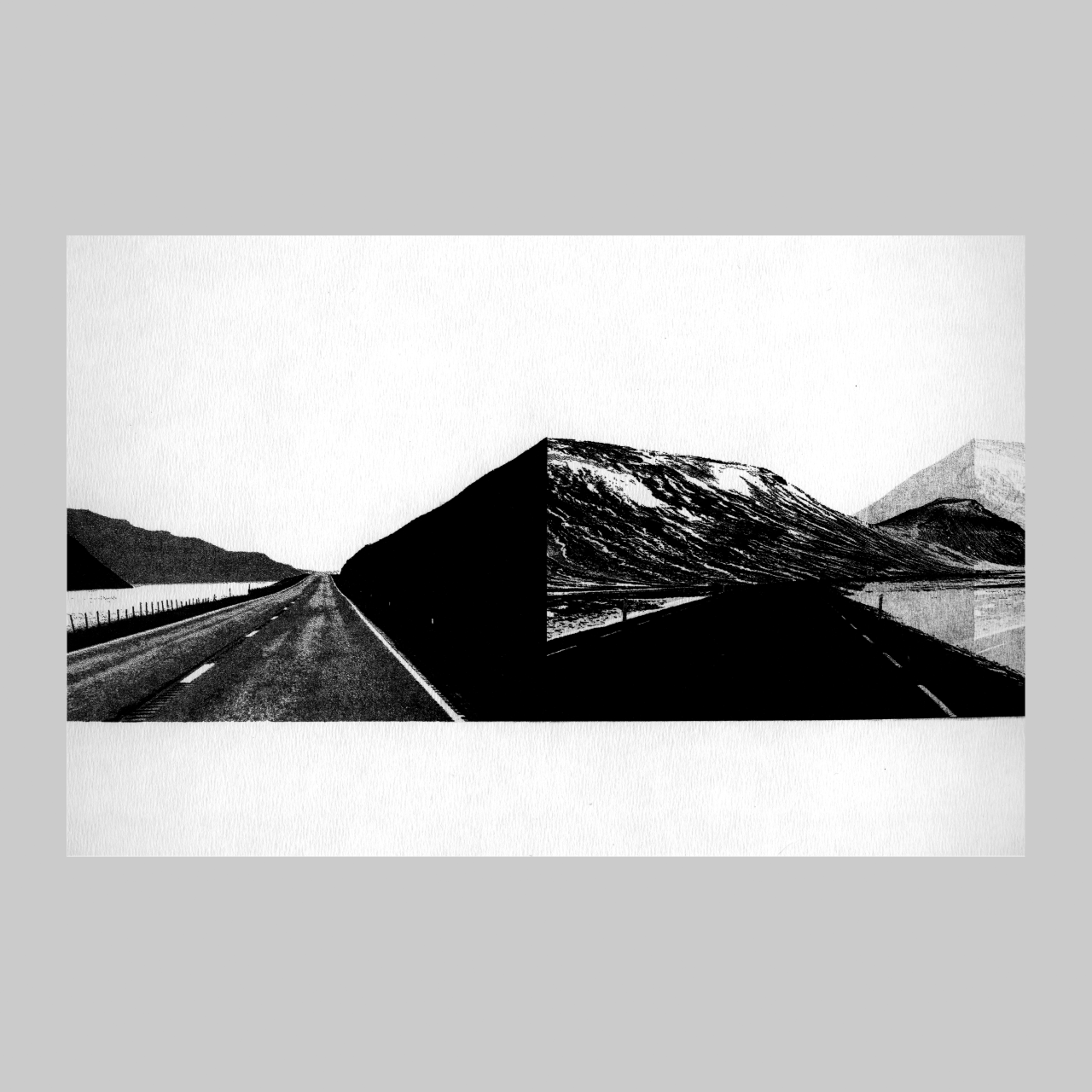
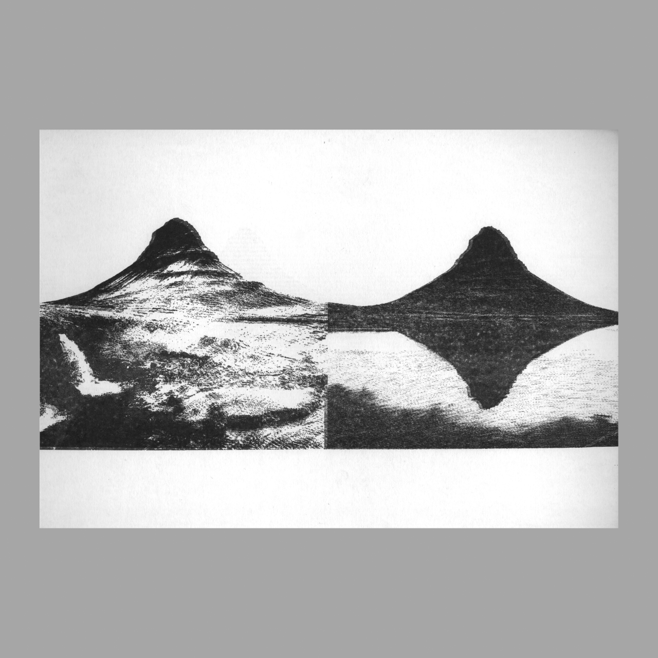
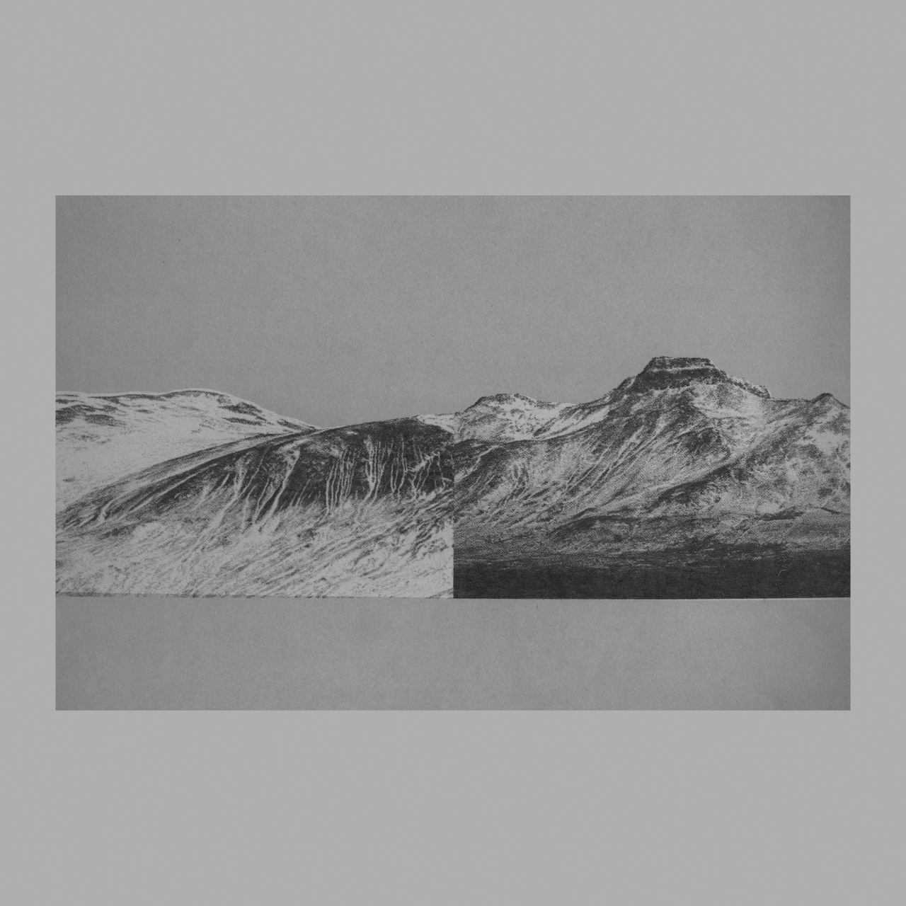
In the summer of 2025, I collaborated with Marion de Boer on an artist book titled Iceland 2324.
This artist book contains hand-printed images based on photographs of mountains, taken during the DEBOER+GRASMAN artist residencies in Iceland in 2023 and 2024.
The book was entirely handmade and self-produced. From our photographs, we created master sheets, which we printed manually using a vintage Gestetner stencil duplicator. This process introduced a high degree of variation between prints — making each copy of the book unique. We then manually scored, folded, glued, bound, and trimmed the pages, and added front and back covers by hand.
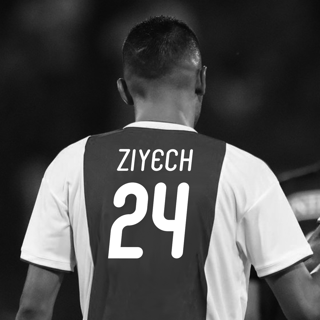
For the cover typography, we used More Dots, a typeface by Beware of the Moose, built from seven circles — each letter or numeral constructed from a unique combination of these circles.
T-shirt with pangram in the Modular. There will also be versions in other languages. Available early 2024.
> put me on the waiting list
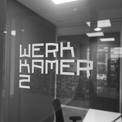
Moules used for signing at M.O.S. in Drachten, Netherlands
> BUY THIS FONT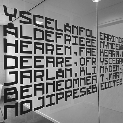
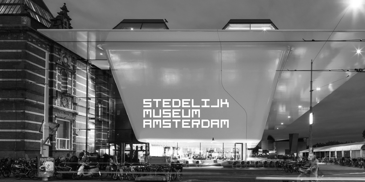
Moules applied to the windows of the offices at M.O.S. in Drachten, Netherlands. The original text of the Frisian national anthem was used for the text. To emphasize the vertical character, all spaces have been omitted.
> BUY THIS FONT


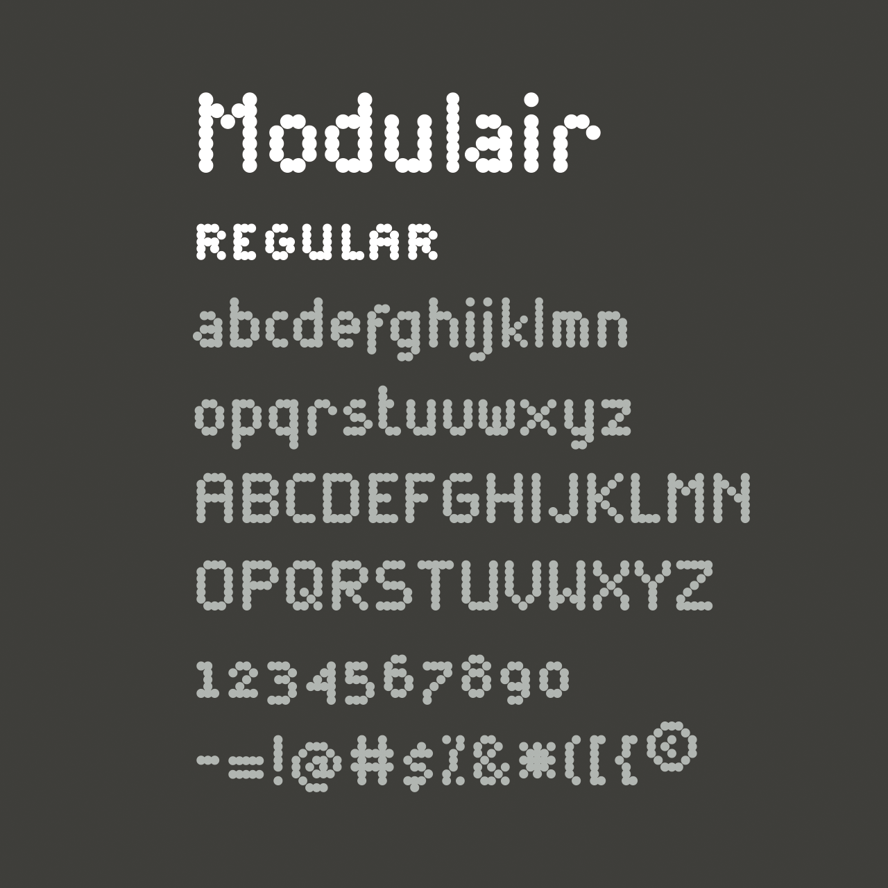
Modulair is a dot matrix based font with nice typographic features. Various figures, complete punctuation and small caps in three weights makes the Modulair a very usable font for subtile typographic solutions or headlines.
June 2020
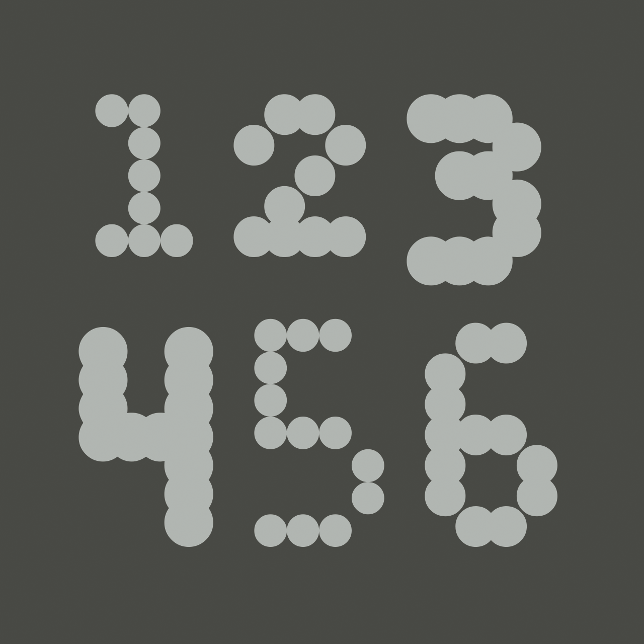
Modulair has hanging and titling numbers
modulair light
modulair regular
modulair bold
Modulair regular italic
Availible this autumn
Modulair regular italic
> BUY THIS FONT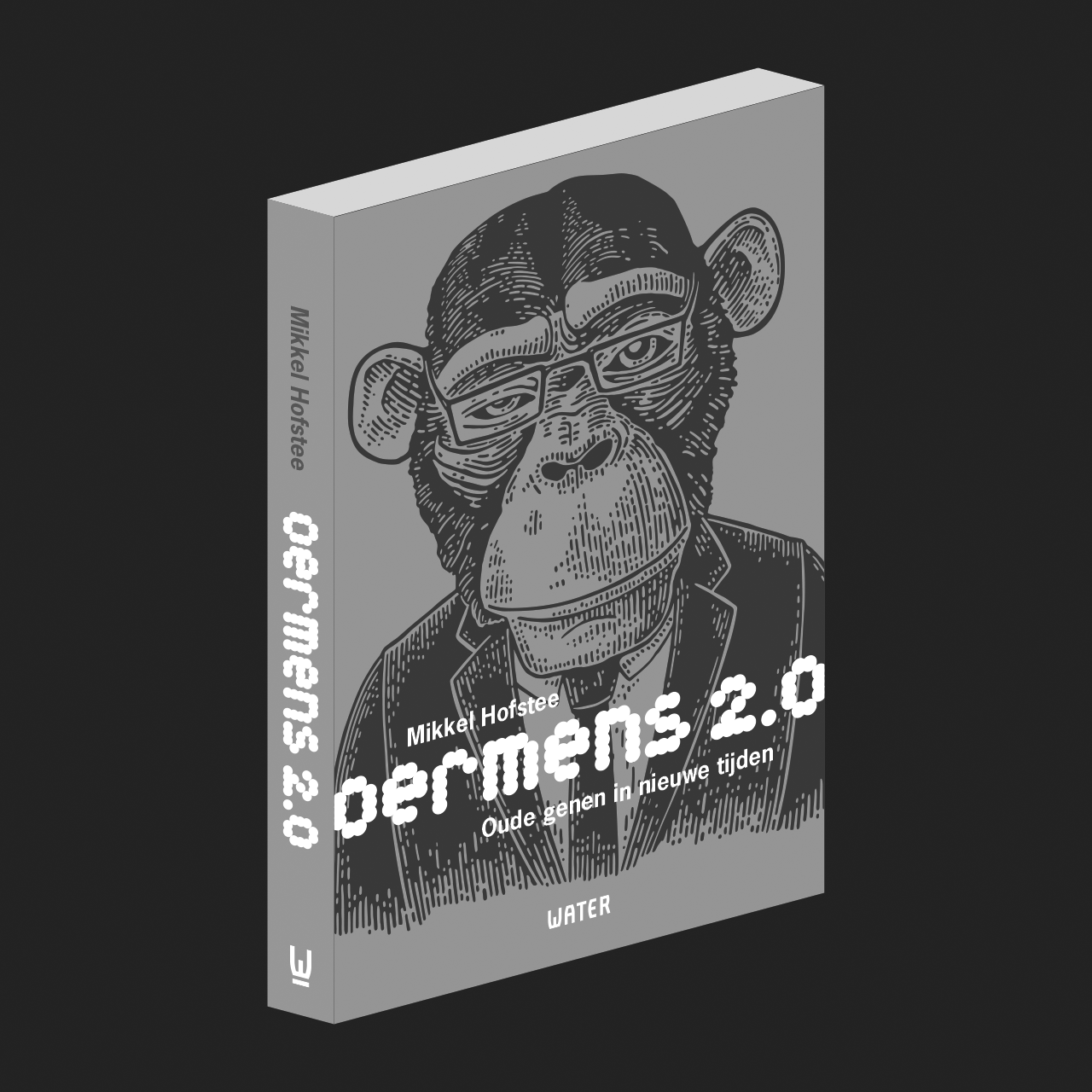
First use of Modulair font. Book is also available in English – Primal Human 2.0
> BUY THIS FONT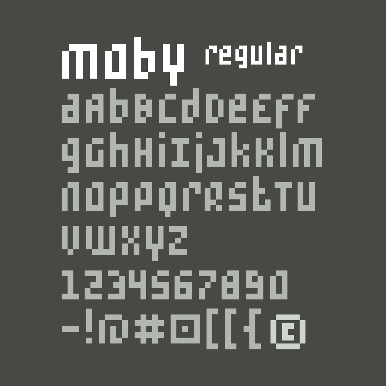
Moby is a font based on a grid of squares. The upper case and lower case have the same height. Some of the characters have an ascender or a descender that gives the font some movement. There are three variations of rounding and all version have a italic.
> BUY THIS FONT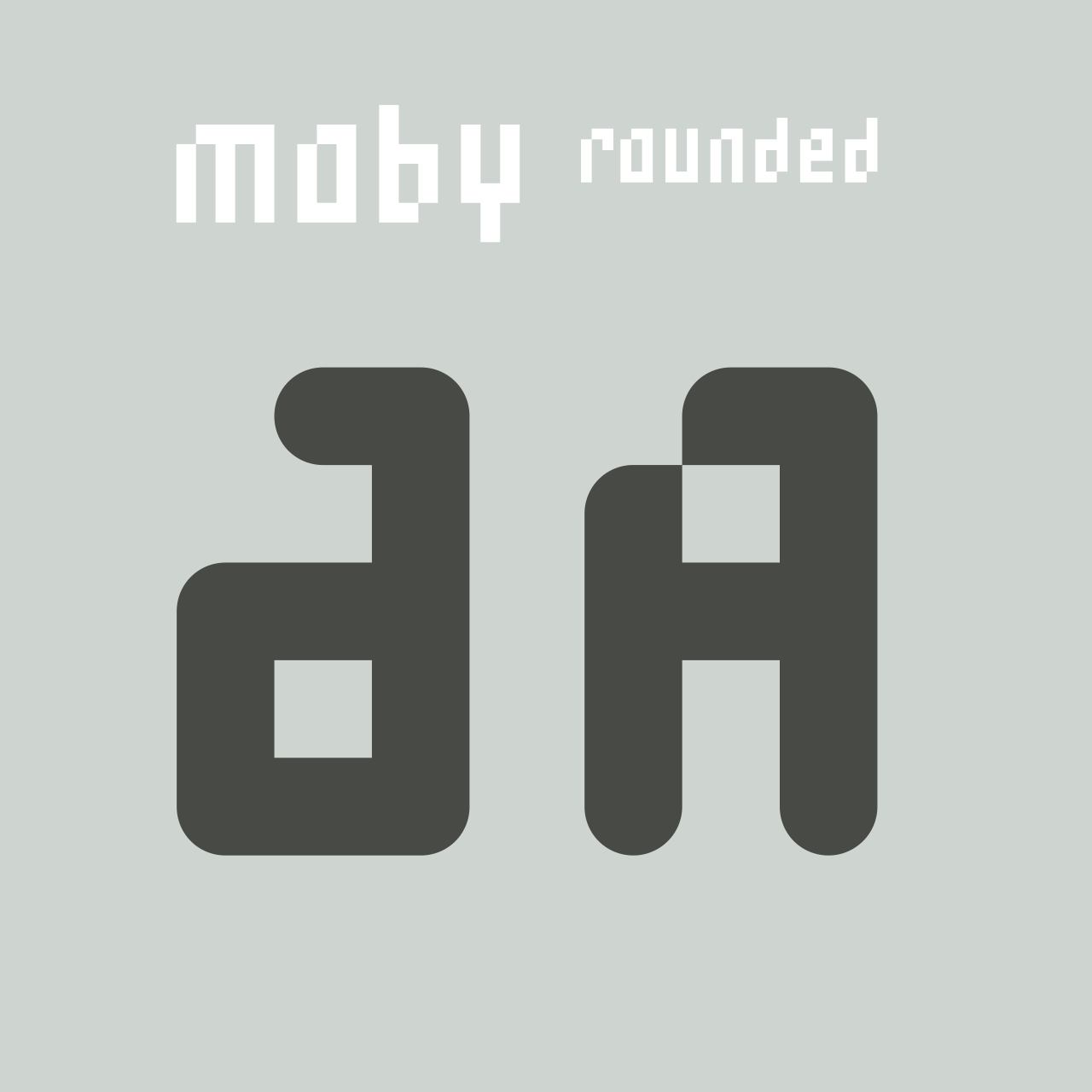
Moby has three variations of rounding
> BUY THIS FONT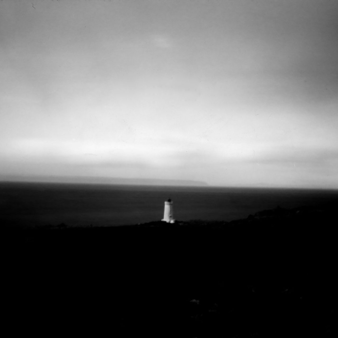
Pinhole photo of Skardsviti Lighthouse Iceland taken during my stay at NES Artist Residency, May/June 2023.
The photo is part of the pinhole exhibition at Gallery Unique Photo in Philadelphia from April 1st to May 31st.
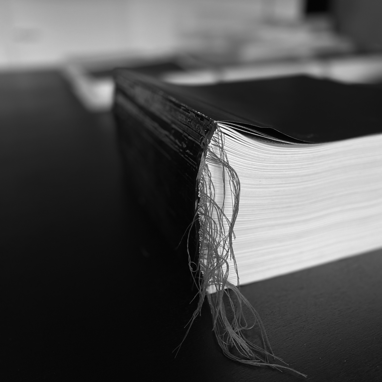
Mersenne 51 is a book with the 51st Mersenne prime number. Almost 25 million digits, 2112 pages and almost 10 kilos ... the number is only divisible by 1 and the number itself. It is part of the project with the font More Dots that is made up of 7 circles and has 127 shape variations. Both also Mersenne primes.
Mersenne 51 is part of the floating exhibition Kaalstaart in April.
April 5 - 6
Amersfoort
Insteekhaven Nijverheidsweg
April 12 - 15
Zwolle
Schuttevaerkade
April 18 - 21
Groningen
Zuiderhaven
April 26 - 27
Dokkum
Grootdiep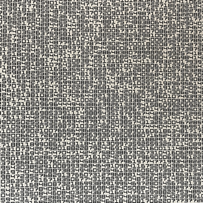
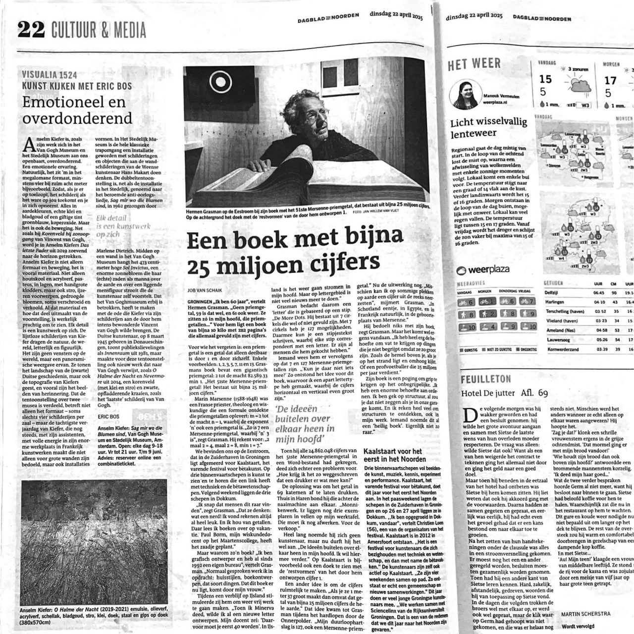
A book with almost 25 million digits, ARTICLE IN Dagblad van het noorden BY JOB VAN SCHAIK – PHOTO JAN WILLEM VAN VLIET – ABOUT THE BOOK MERSENNE 51.
Maisonneuve regular
> BUY THIS FONT
Maisonneuve regular
> BUY THIS FONT
Maisonneuve regular
> BUY THIS FONT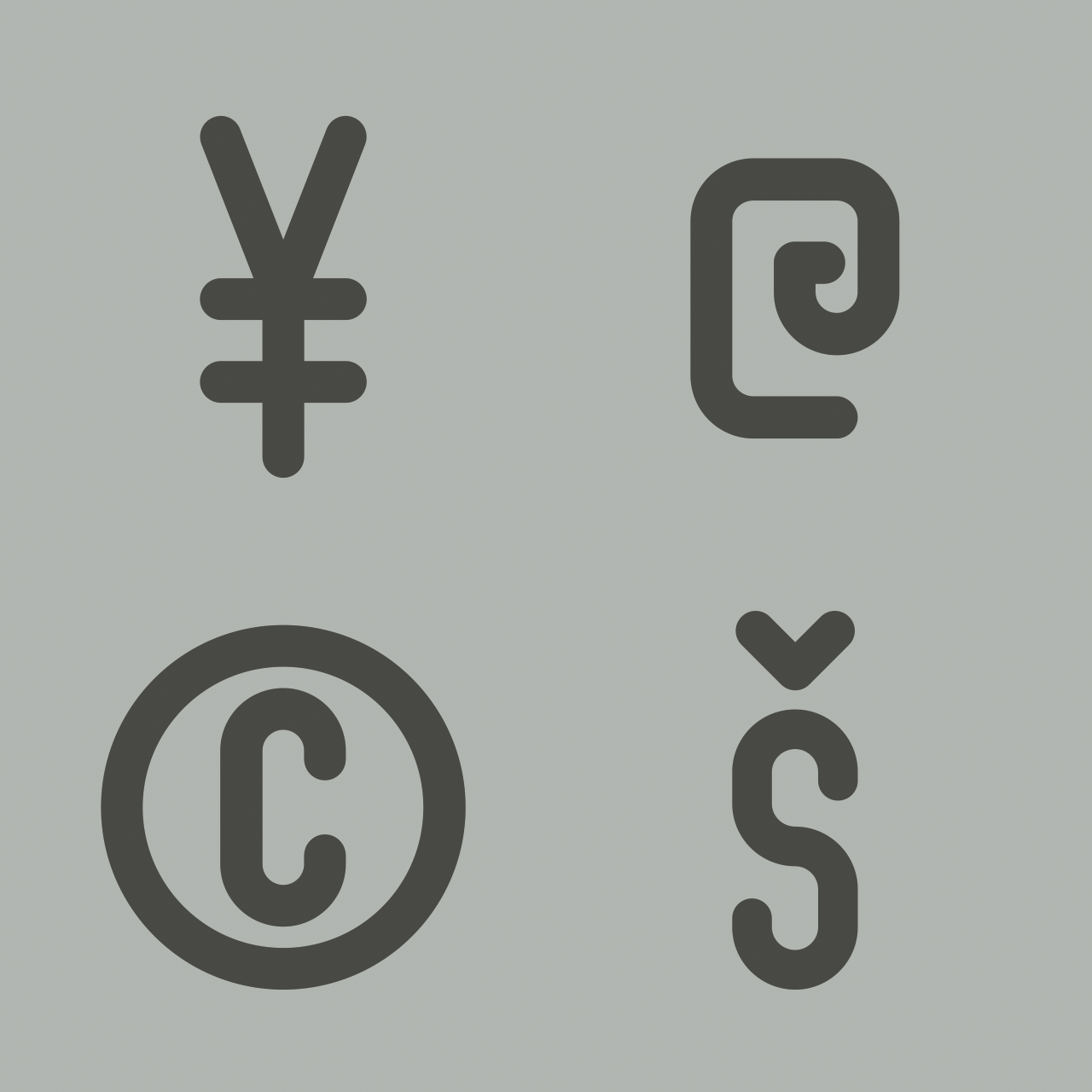
Maisonneuve regular
> BUY THIS FONT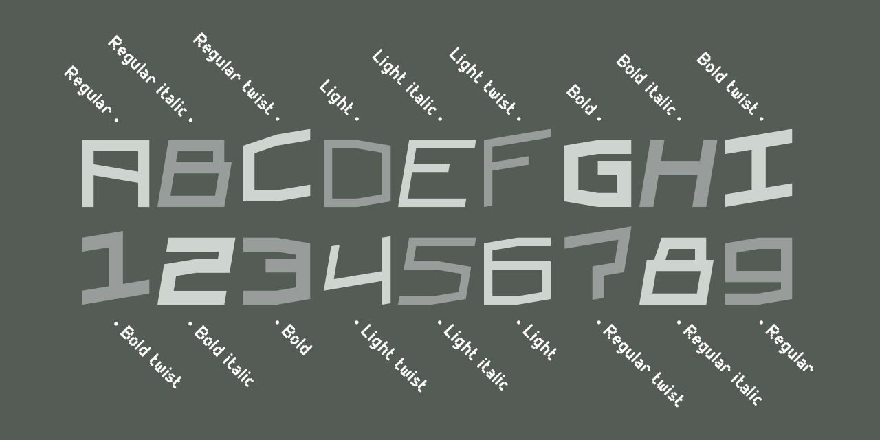
Moules. Mono space. roman, italic and twisted all in three weights – light, regular and bold.
> BUY THIS FONT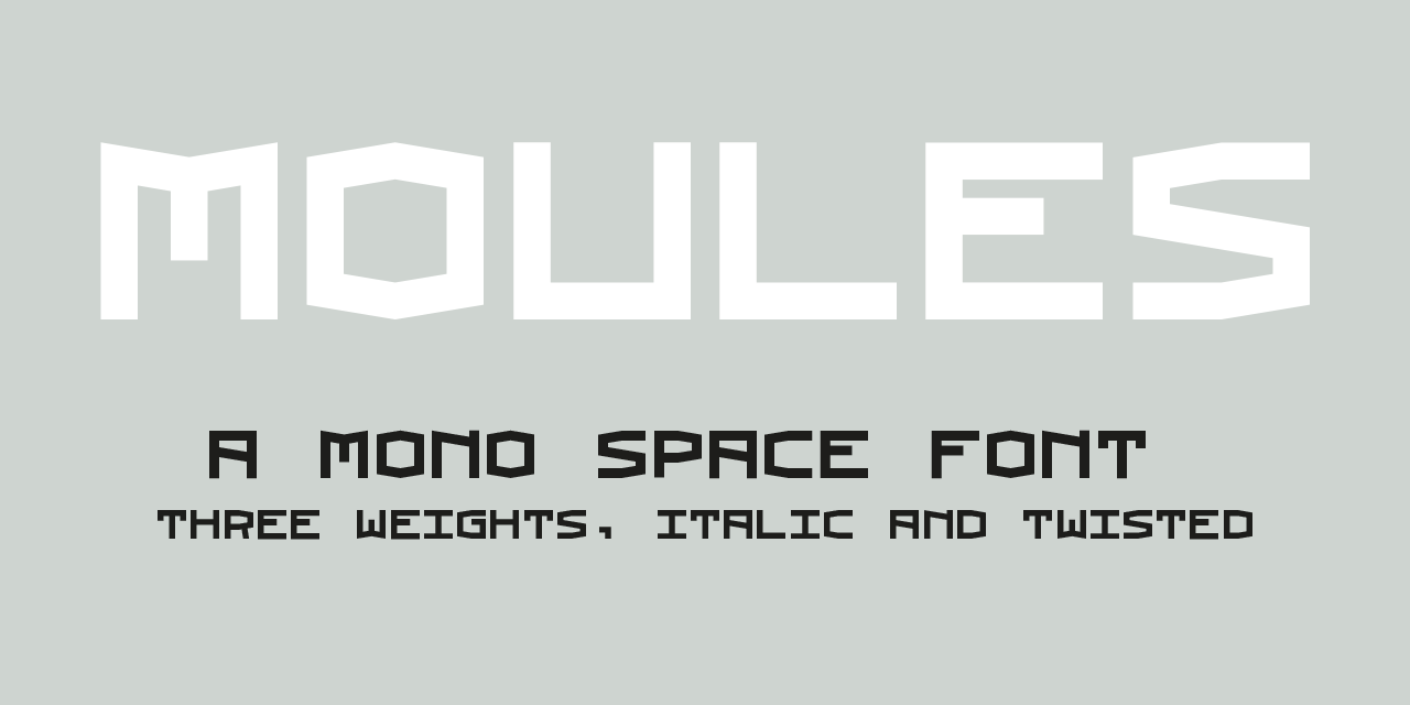
Moules is a mono spaced font family coming in three weights and three different forms, roman, italic and twisted. This font has more details than my first mono spaced font – Memory Square – and gives the possibility for more subtile typography.
May 2022
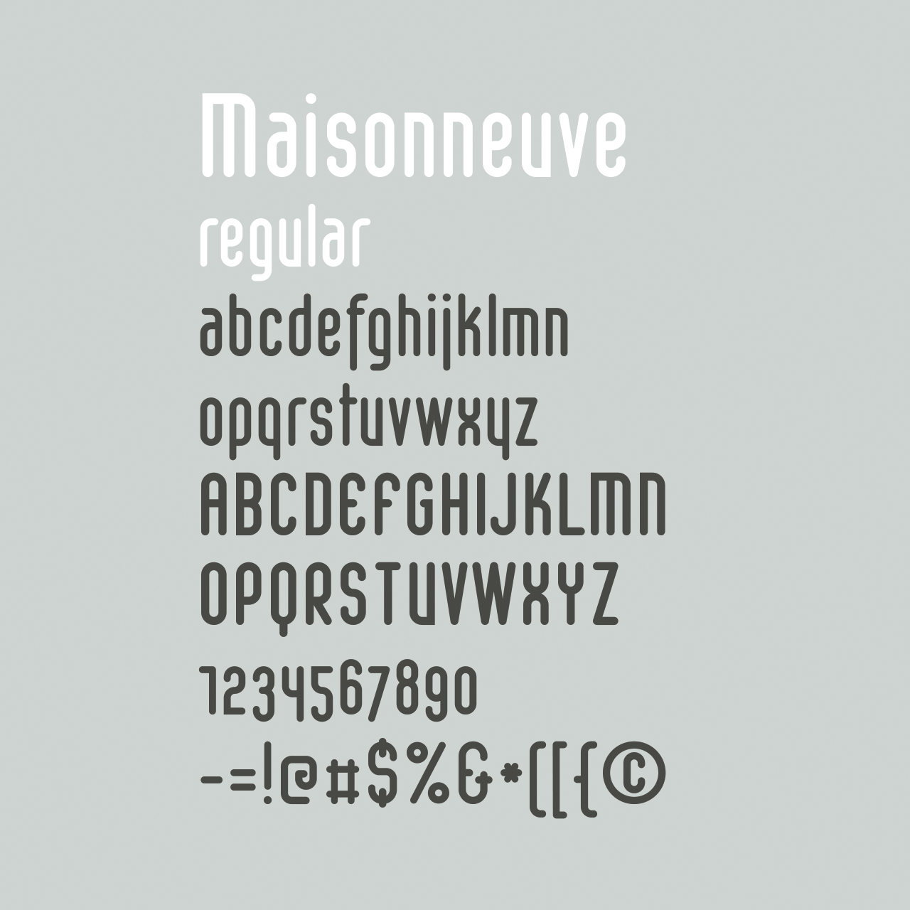
Maisonneuve is named after the fracture I had in 2019. During the period of revalidation this font was born passed on circles and rectangles. A modern – almost modular – font with old school figures and lots of symbols and good readability and legibility.
November 2020

MOULES LIGHT
> BUY THIS FONT
Moules bold italic
> BUY THIS FONT
MOULES LIGHT TWIST
> BUY THIS FONT
MOULES REGULAR
> BUY THIS FONT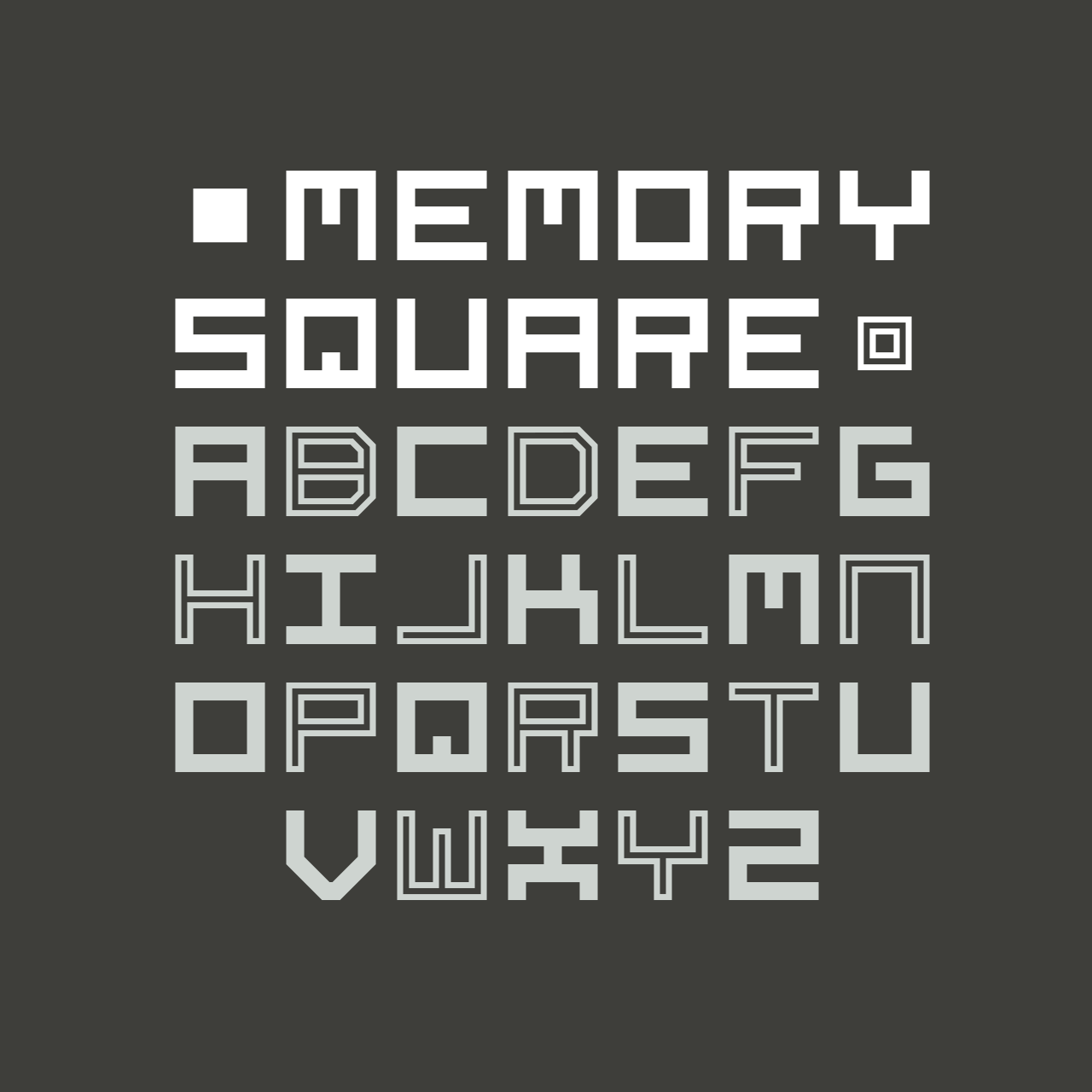
Mono Square is a monospaced font, each glyph has the same width. It is based on 25 rectangles. The font set contains most punctuation marks for normal use.
Memory square family has also a outline version.
december 2020
Memory square regular
> BUY THIS FONT
Memory Square Outline
> BUY THIS FONT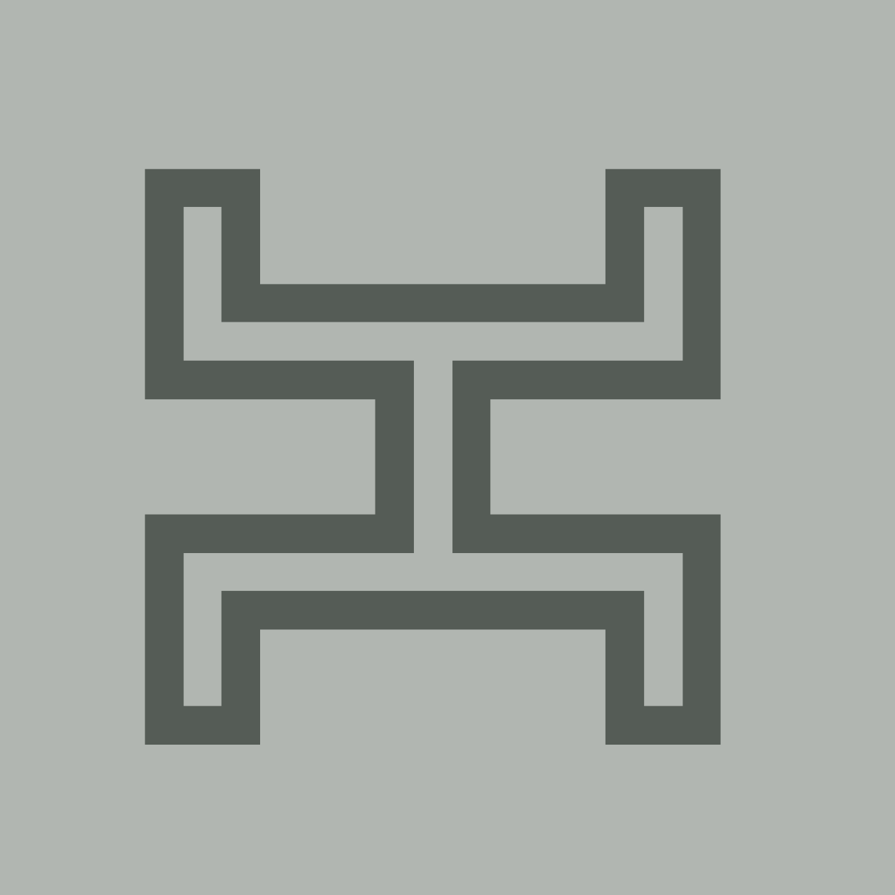
MEMORY SQUARE OUTLINE
> BUY THIS FONT
Moby Regular Italic
> BY THIS FONT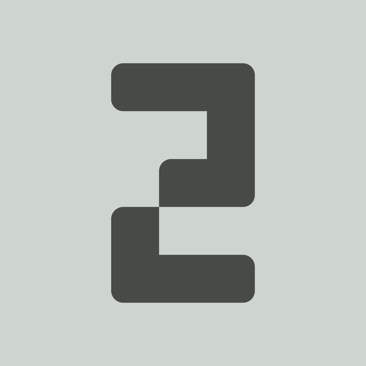
Moby Regular Round 35
> BY THIS FONT
Moby Regular Round 52.5
> BY THIS FONT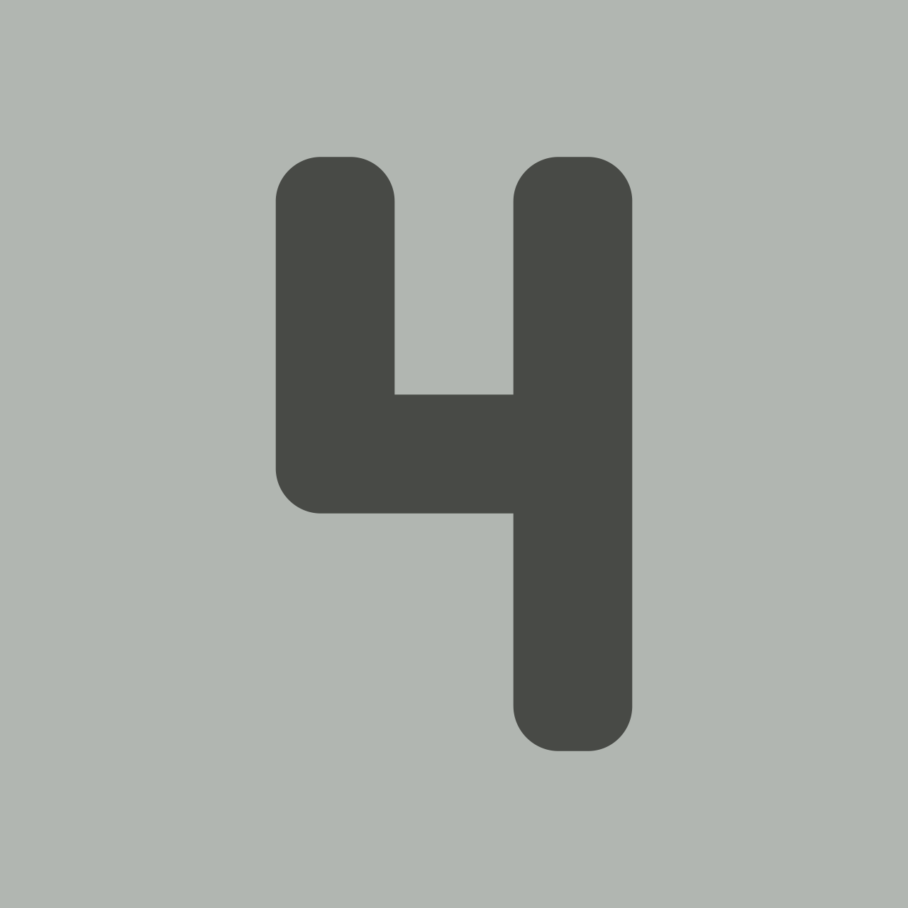
Moby Regular Round 52.2
> BY THIS FONT
In May and June 2023 I worked at NES Artist Residency in Skagaströnd, Iceland. The Moby was completed there - after addition with the Icelandic characters. The first sketches of my new font Moss were made there and developed into a complete font set in regular.